Dashboard tutorial
Misinformation online generates misperceptions. The speed and ease in which false news spread on social media have a massive impact on current affairs and policies. By bringing together a multidisciplinary team of researchers and experts in computer science, behavioural science, and sociology, Co-Inform aims at engaging all stakeholders in fighting misinformation by providing them with the tools to identify ‘fake news’ online, understand how they spread, and provide them with verified information.
To this end, Co-Inform has developed the Dashboards. A tool for fact-checking policymakers and journalists, showing that misinformation was detected, where it originated from, how and where it has spread and what’s the current and predicted public perception. The dashboards also show the news articles or information that users requested to be fact-checked.
This Co-Inform Dashboards offers the following functionalities.
Customizable and End-User Dashboards
As described above, we consider two main types of users. Dashboard admins can configure dashboards to focus attention on specific types of data as requested by the policymakers or journalists. Dashboard admins can essentially reconfigure the full interface, adding or removing components as needed. Once the main graphs to be displayed have been defined, the admins can release the dashboard, which essentially deactivates customizability.
Overview of data
The following screenshot of the default dashboard was taken on 27/07/2020. It shows that the dashboard can be configured to show an overview of data. In particular the first row of components, provides an overview of key numbers needed to understand the rest of the dashboard. It shows:
-
- total number of collected documents,
- total number of those that have been rated for credibility,
- number of “not credible” (misinforming) documents
- number of “credible” documents
- a pie chart showing the distribution of credibility labels (for the rated documents)
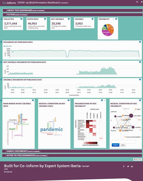
The “Documents by Published Date” component further helps to provide an overview by showing how many documents have been collected by date (in this case for the past 3 months)
(Credibility) Timelines
The three widgets for “Documents by Published Date”, “Not Credible Documents by Published Date” and “Credible Documents by Published Date” can be used to compare trends in misinformation. In particular, these charts can be used to identify times when there are spikes in disinformation. The end-users can click on these charts to narrow down the time filter. For example, to focus on the day or week where there is a spike in “not credible” documents.
Analysis and comparison of data correlated to misinformation
The next row shows some of the Banana components that can be configured to analyse misinformation correlations in our database. We reproduce the row:
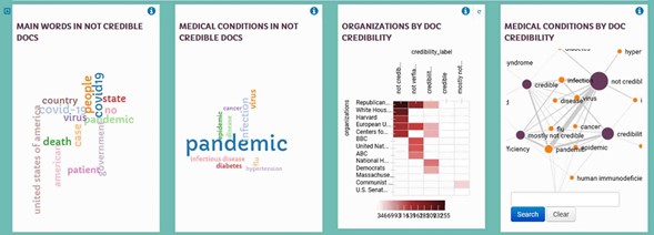
The first two components show two types of correlations with “not credible” documents:
-
- Main words: these are the most relevant words extracted from documents which have also been rated as having low-credibility. This provides a sense about some of the topics that are discussed in most of those documents.
- Medical Conditions: this is one of about 20 different types of (domain specific) entities (see D3.1 for more details on the semantic enrichments provided by Expert System’s Cogito analysis) that can be analysed. In this case, since the dashboard focuses on covid-19, it makes sense to look for correlations with entities related to health.
The third and fourth components provide a way to explore strength of correlations between entities extracted from the text and level of credibility of the documents:
-
- The “Organizations by Doc Credibility” show on the vertical axis, some of the most frequently mentioned organizations in the texts. On the horizontal axis, the (automatically calculated) credibility labels are shown. This shows for example that the Republican Party and the White House are mentioned in documents which are deemed to be “not credible”. The United Nations on the other hand are mentioned in documents deemed to be “not verifiable”.
- The “Medical Conditions by Doc Credibility” shows a different visualization of the same type of information. In this case the entities are “Medical Conditions” once again. The size of the circles and the lines between them shows how much a specific medical condition co-occurs with documents having different credibility levels.
Filtering of data
Most of the components shown until now can be used to add a filter. We already said that users can select a time in the timeline components to add a filter on a particular day or week. Similarly, users can click on the pie chart to only focus on documents that have been labeled as “not credible”.
Dashboard admins can choose to provide filtering components as well. In the default dashboard such components are hidden but can be shown by clicking on the “Filters” bar. By default, this shows something like:

This can be used to see all the documents from the last 90 days, 1 hour, 24 hours, 7 days, etc. (as always this is configurable).
The Filters component provides filters by categories, source (i.e. where the documents were retrieve from), organizations or people mentioned in the documents. Again, the Cogito semantic analysis provides a large number of options that can be leveraged to let the end-user select filters that may be relevant to their work.
Self-documenting dashboard
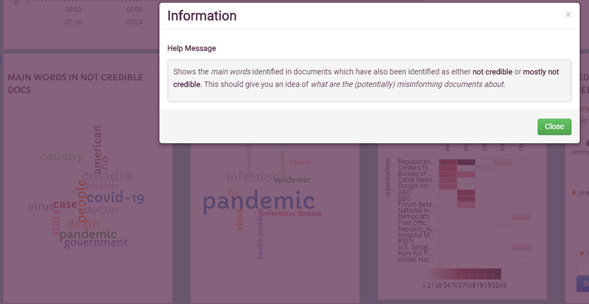
The dashboard provides a way for dashboard admins to explain what each component is showing and how to interpret the data. For example, by clicking on the button for the “Main Words in Not Credible Docs” component, the following help message is shown:
Similarly, when necessary, “text” components can be added to explain more about the dashboard. For example, the first row (collapsed by default) expands to:
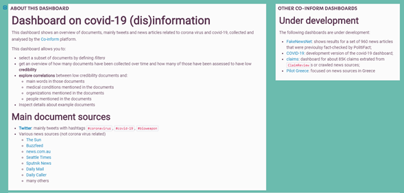
Which provides context for understanding the data shown in the dashboard and provides links to other dashboards that may be of interest.
Document details
Although dashboards are meant to provide an aggregate view over large numbers of documents, the dashboard also allows to inspect individual documents. These are first shown as a table:
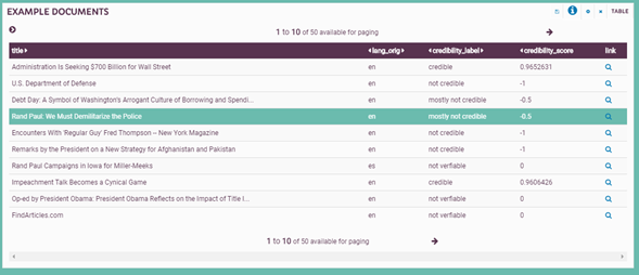
But individual rows can be selected, which will show custom cards providing more detailed information about the document and the credibility review (and label) assigned to it:
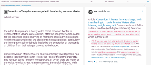
The credibility review card on the right shows an explanation for why the system predicted a specific label for the document. Like the browser plug-in users will be able to agree or disagree with the predicted label.
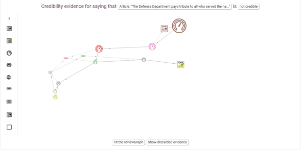
An experimental feature is the “reviewGraph” which provides a graphical representation of the explanation card. For example:
Dashboards demo video
Here you can find a demo video of the Co-Inform Dashboards policymakers and journalists oriented tool.
Subscribe to our newsletter
Get our latest project updates, news and events announcements first!

Co-inform project is co-funded by Horizon 2020 – the Framework Programme for Research and Innovation (2014-2020)
H2020-SC6-CO-CREATION-2016-2017 (CO-CREATION FOR GROWTH AND INCLUSION)
Type of action: RIA (Research and Innovation action)
Proposal number: 770302
